
Owners, stakeholders and managers are looking for a way to develop a responsive website design that is aligned with the restaurant spirit, energy, and brand and is accessible to new and existing customers who look to place an order, make a reservation and checkout monthly events and specials.
The Challenge
The goal is to create a design that works effectively and allows the user to perceive the overall ambiance of the restaurant through multiple platforms in order to improve the restaurant’s online presence and increase its audience reach.
The Goal
Research and Interviews
As the member in charge of UX Research I started by sitting down with stakeholders, managers and customers who frequent the restaurant to try to understand what drives Brauhaus internally — culture, principles, standards, and values — vs what attracts customers to return to Brauhaus.

Want to create a presence online where most customer who look forward to the weekend will see the restaurant website on their phone or computer and will want to spend their time off at the restaurant.
Stakeholders
Culture
Inspired by their experience abroad while traveling they want to offer a space where people can come together to sit down and catch break from the busy schedule, a momentary breathe of air where the busy city life and obligations are not a priority but instead are temporarily separated from the customer. “Here customers should be able to fully capture and enjoy the moments spent alone, or with friends, away from the city chaos around them.


Competitive Audit
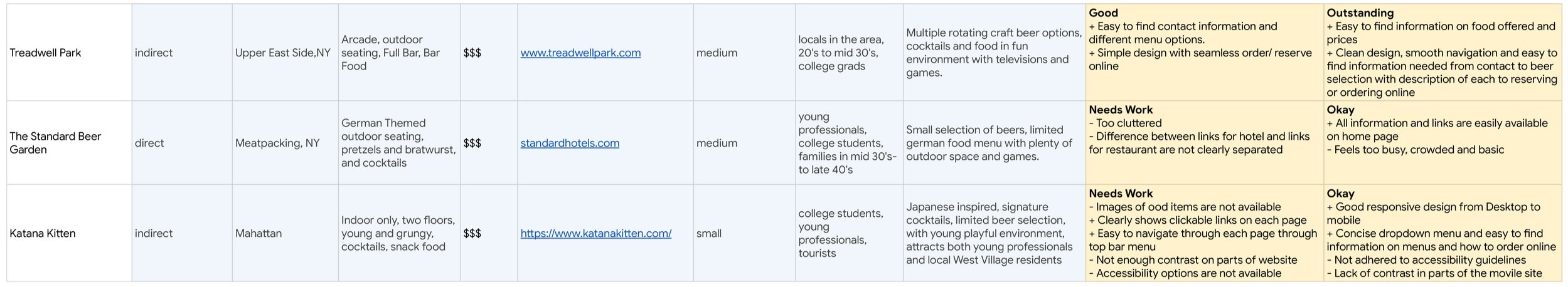
Opportunity
Create a website easily accessible in both mobile and desktop that addresses users of different ages and different levels of technological maturity
Incorporate accessibility features such as images, descriptions, clear language, icons, button interactions, contrast and readers into each screen for an overall accessible design throughout.
Approach website design and user flows based on current (post pandemic) users’ needs in order to provide a thoughtful experience and attract more guests — visitors and locals — to the restaurant.
Ideation
Once all the research details from the interviews and audits was gathered and synthesized, as the lead designer, I began the ideation process by setting the parameters of the new website through an initial Site Map, where I could ensure all the necessary parent and child pages would be incorporated prior to exploring the designs brand, interactions, visuals and types.

Site Map
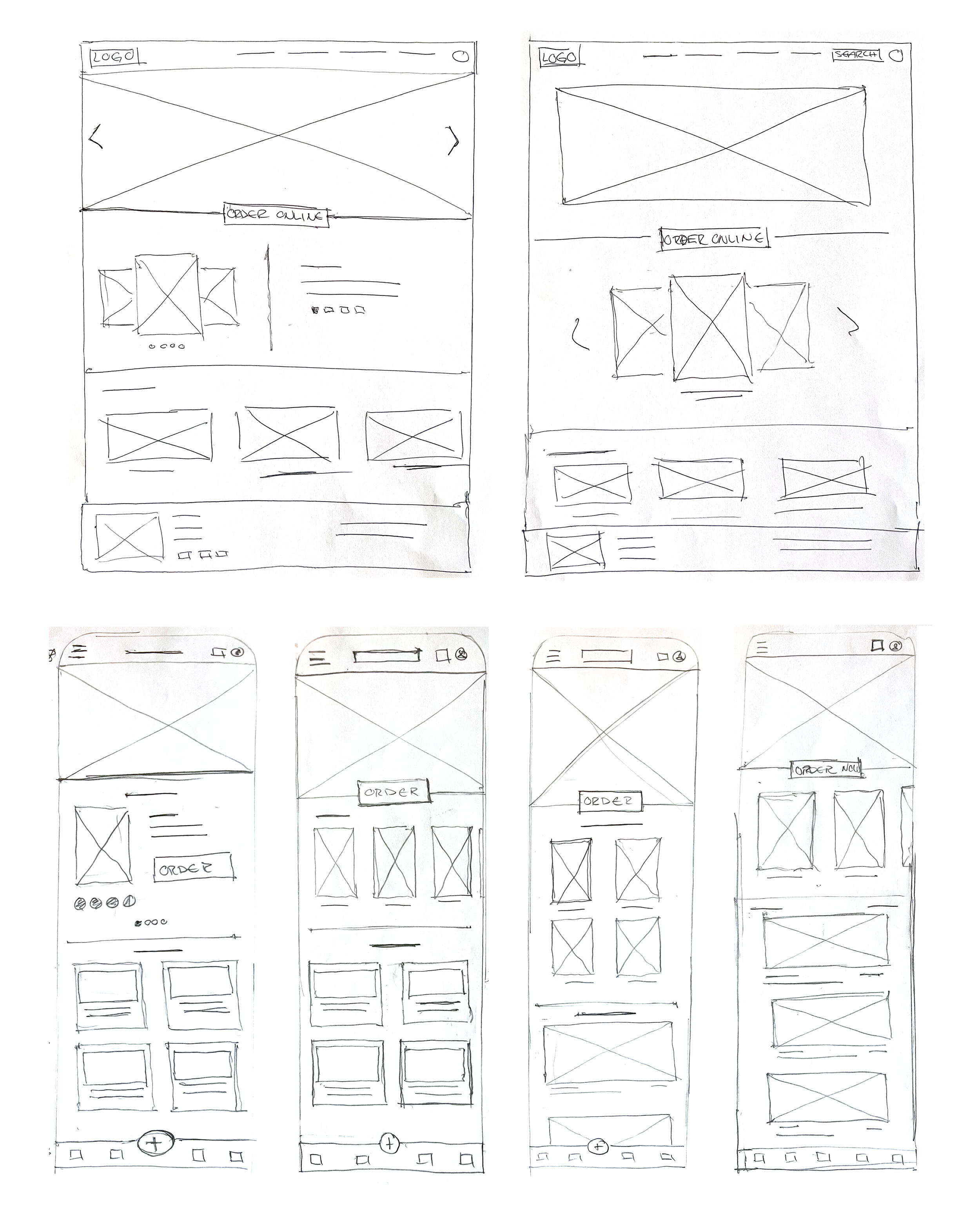
Wireframes
I relied on paper wireframes, due to their rapidity and ease, to explore ideas on the initial screen designs for the new website. With these wireframes I was able to demonstrate how each element can be modified or transformed from platform to platform based on where the user will be when they access the website.


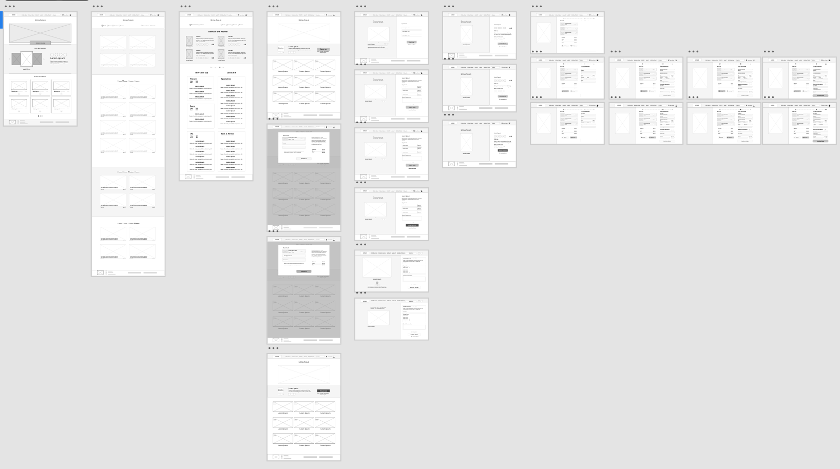
Mid-Fi Prototype
As a UX designer it was my task to translate the components and functions found on the Home Page from a desktop view to what it would look like if the user was experiencing the same journey on a mobile and tablet platform. I maintained the established information architecture from the original design to support the different storytelling modes across different platforms.

Unmoderated Usability Testing
After performing and assessing an unmoderated usability test on 6 different users I redesigned wireframes considering the their feedback, insights, and struggles.
Insights


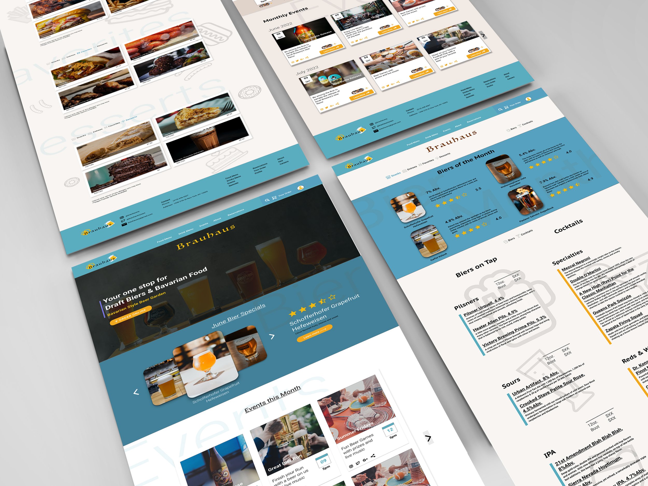
HiFi Screens
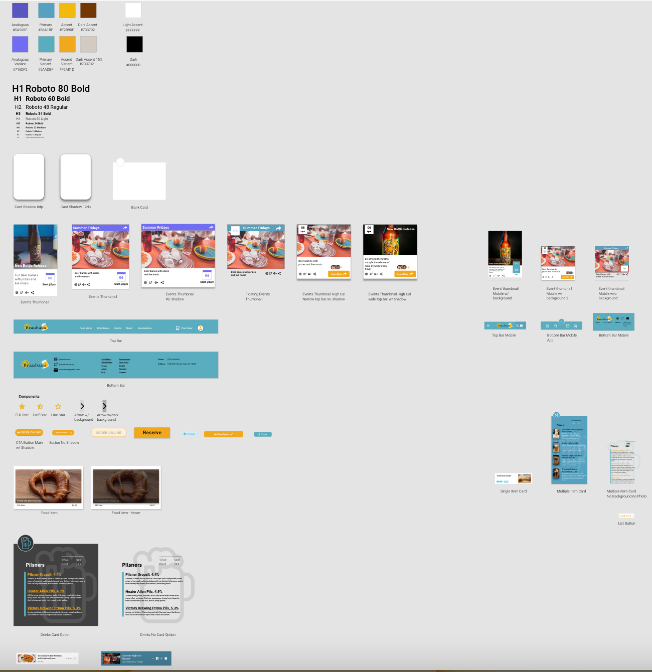
Design Systems

Hifi User Flow
The Hifi prototype is completed on both mobile and desktop platforms for further usability testing of user journeys, flows, interactions and functionality on a daily basis.


Place a Food Order Online - Desktop
Place a Drink Order Online - Desktop
Make an Event Reservation - Desktop
Make a Payment Online - Desktop
Place a Drink Order Online - Mobile